Is your brand readable?
#Branding #Design #Export #Tips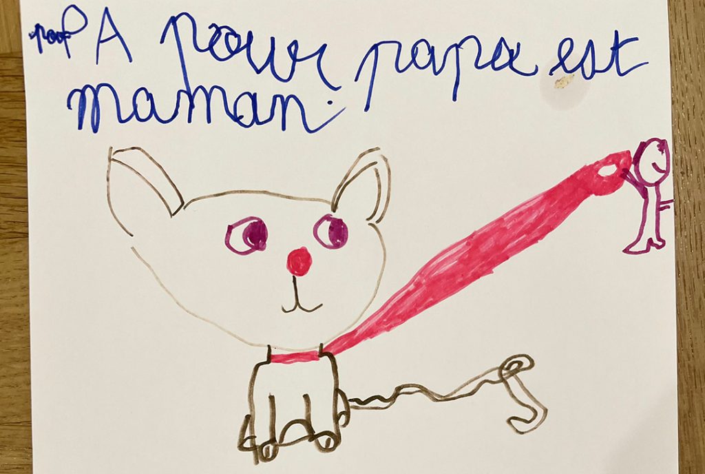
Cursive, or not cursive, that is the question. Well, is it?
At Making You Smile, quite a few of us have children aged between 5 and 7.
They all go to school in France, and one of their everyday challenges (?) is to learn and improve reading and writing.
One day, we started wondering, “how important is it for our children to learn cursive handwriting in today’s world where print and digital letters dominate?” (To our fellow parents – we admit that this is a real topic in its own right.)
…But instead, we ended up talking about brands that use cursive fonts.
We’re a branding agency after all.
We agree that using cursive for your logo or communications tools can be a good way to give your brand a friendly, human, or even a fancy touch.
Also, brands with long and rich histories tend to love handwriting styles.
However, in the flood of content that everyone is faced with today, readability is essential.
Whether it’s your logo, a tagline or copy placed on any type of the media you’re using to reach your target audience, things should be easy to read and understand.
And going for certain cursive fonts isn’t probably the best way forward (especially if your business is new).
It’s even truer if you’re taking it global.
Let’s not forget that in many countries, people are NOT used to reading cursive alphabet letters.
At the end of the day, you don’t want to make your prospects tilt their heads or squint, do you?


